

BRANDING
COMMUNITY AFFAIRS VISUAL STYLE & GUIDE
OBJECTIVE: Design and develop the visual branding, and a supporting style guide, for the new Community Affairs team at Bass Pro Shops.

Shortly after rejoining Bass Pro Shops for my second tour, I was asked to collaborate with the Community Affairs team on a special project. >>>

The team was brand new, led by a member of the Morris family, and had big ideas for getting their message out. >>>

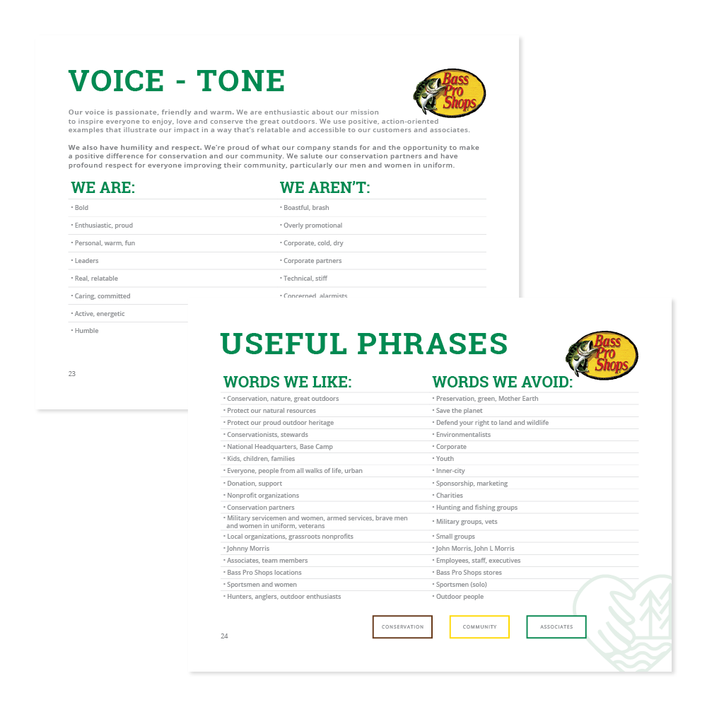
I was asked to develop the visual branding and style guide for the new Community Affairs team that could be used by creatives inside and outside the company. >>>

It should provide complete creative direction, including fonts, colors, icons, layouts, as well as instructions for photo, video and copy direction. >>>
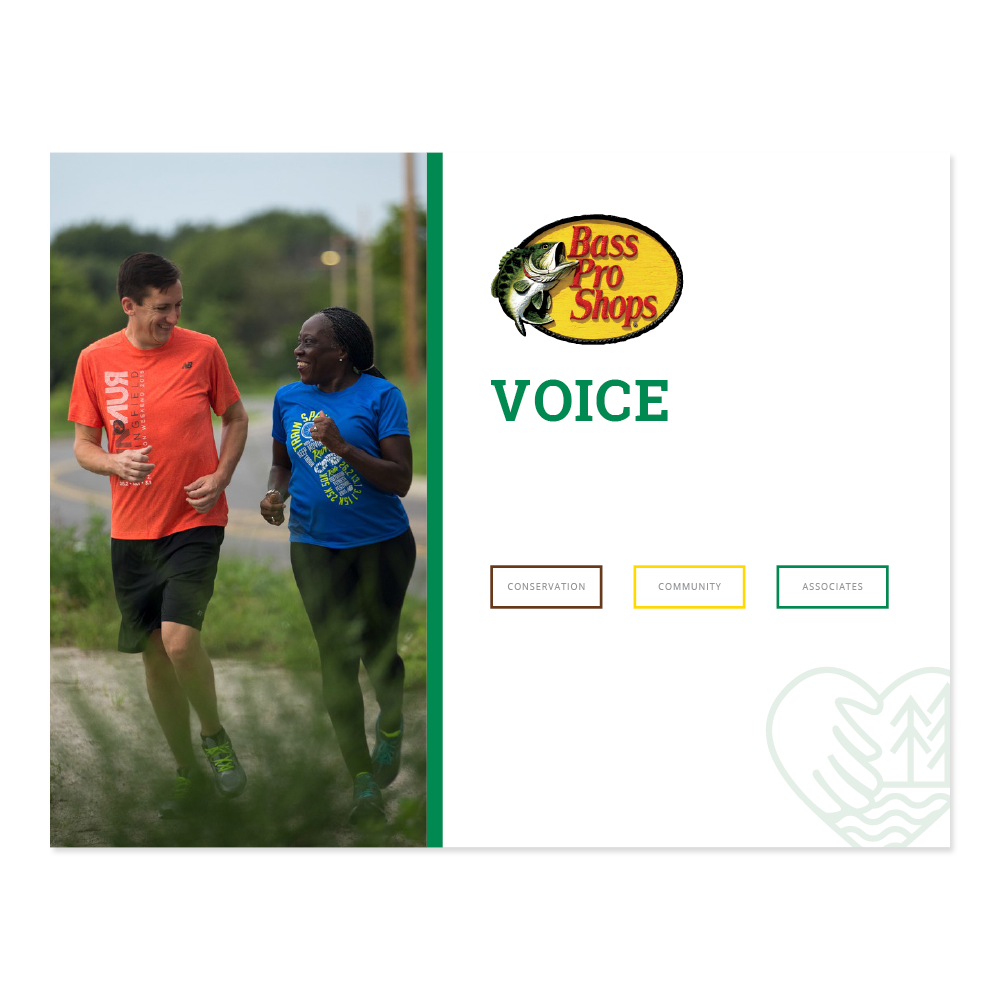
Since there weren't dedicated resources for the effort, this style guide would be responsible for ensuring consistency no matter who would be executing creative. >>>
The result was an exhaustive guide that was widely distributed and successfully implemented across all channels.
TRACKER BRAND WEEKEND
OBJECTIVE: Create a consumer campaign to promote three Tracker brands under one, unifying theme, while doubling as an associate training opportunity.
First, we developed a universal truth that would allow us to present three brands together in a way that would resonate with consumers and educate associates. >>>
Next, we created a responsive landing page to provide educational information for associates to train and customers who may not make it to a store. >>>
To execute the campaign, we designed and deployed a fleet of digital ads (30 different sizes), emails and social posts to drive traffic to the landing page. >>>
In stores, we created a connection to the digital campaign while directing customers to associates. This gave associates a chance to share their brand knowledge. >>>
Associates also wore buttons inviting a brand conversation. This empowered them to educate themselves and be ready to answer, “What does Tracker stand for?” >>>
The final element of the campaign was an oversized trifold brochure that served as a training resource for associates and a takeaway for customers to learn more. >>>
The Tracker Brand Weekend campaign resulted in an increase in both consumer and associate awareness and education.
TRITON BOATS
BRAND REFRESH
OBJECTIVE: Develop a new brand strategy, with an updated look and feel, for Triton Boats. It should convey new company leadership, new focus and a renewed commitment to the brand.

We began by simplifying the logo and introducing a new tagline. The new branding leaned into Triton's racing origin and their core audience—hardcore anglers. >>>

After landing on a new tagline, we developed a brand essence statement to provide more depth and context. Click the image above to watch it come to life. >>>

Next, we created a style guide to provide direction on all aspects of creative execution. Every element of the brand was adjusted to reflect the new strategy. >>>

New, on-strategy imagery led the effort to refresh the annual brochure, while the updated graphics rounded it out. Click the image to see it before the redesign. >>>

The new photography style captured the intensity of Triton customers—allowing the product to finally live up to its reputation again.